Caveats:
None. Usually used with groups, but can be used for individual as well.
Required:
Piece of paper - usually A3
A different colour marker for each measurement point (at least start and end will be required)
Optional:
The neater you set things up, the better the result will look.
Eg, use a ruler for drawing the axes, reserve the black marker for the axes, draw a neat legend, etc
Step 1: Place the sheet in landscape
Step 2: Draw straight vertical and horizontal axes along the left and bottom sides.
I place the "feeling" axis as the vertical as it is useful to visualise whether a vertical shift up or down was happier/sadder, more enthusiastic/less enthusiastic.
I place the "knowledge" axis along the horizontal as there is less emotional expression required for knowledge.
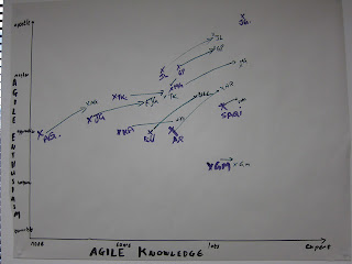
In the example, which I used for Agile Awareness training purposes, the axis on the left is "Agile Enthusiasm" and on the bottom is "Agile Knowledge"
Step 3: Pick 4-5 indicators for each axis. It is sometimes very useful, depending on what you are measuring, to ensure there is no obvious "average"/"middle of the road" indicator in order to subtly influence people to make a decision on where they are, which helps for self-enforced consistency during training and afterwards also (see Robert Cialdini's Influence).
In the example I've used:
- Agile Enthusiasm: Terrorist, Unsure, Apprentice, Master, Apostle
- Agile Knowledge: None, Some, Lots, Expert
Before beginning the session, select 1 colour marker, and ask the group members to indicate where they are on axes. Sometimes initials are useful to help them remember where they placed their "X".
Sometimes, for some issues where I use the "2 Axes Visual Shift Chart" an anonymous "X" is better - eg helping a team go through Tuckman's Mourning / Adjourning Phase when someone has abruptly left the team.
Step 5: Conduct the training, facilitatory event or retrospective. If it is a multi-day event, decide if you want/need to reflect on shifts that have occurred each day by asking for updates at the end of every day.
This example is for a 1 day training course, with measurement taken in the morning, and again at the end of the afternoon. The visual changes above indicate an increase in knowledge (horizontal shift) and/or improvement in enthusiasm (vertical shift) - overall a very positive result for the training I provided that day!
Thankyou for supporting! Let me know how it goes!
None. Usually used with groups, but can be used for individual as well.
Required:
Piece of paper - usually A3
A different colour marker for each measurement point (at least start and end will be required)
Optional:
The neater you set things up, the better the result will look.
Eg, use a ruler for drawing the axes, reserve the black marker for the axes, draw a neat legend, etc
Step 1: Place the sheet in landscape
Step 2: Draw straight vertical and horizontal axes along the left and bottom sides.
I place the "feeling" axis as the vertical as it is useful to visualise whether a vertical shift up or down was happier/sadder, more enthusiastic/less enthusiastic.
I place the "knowledge" axis along the horizontal as there is less emotional expression required for knowledge.
In the example, which I used for Agile Awareness training purposes, the axis on the left is "Agile Enthusiasm" and on the bottom is "Agile Knowledge"
Step 3: Pick 4-5 indicators for each axis. It is sometimes very useful, depending on what you are measuring, to ensure there is no obvious "average"/"middle of the road" indicator in order to subtly influence people to make a decision on where they are, which helps for self-enforced consistency during training and afterwards also (see Robert Cialdini's Influence).
In the example I've used:
- Agile Enthusiasm: Terrorist, Unsure, Apprentice, Master, Apostle
- Agile Knowledge: None, Some, Lots, Expert
Before beginning the session, select 1 colour marker, and ask the group members to indicate where they are on axes. Sometimes initials are useful to help them remember where they placed their "X".
Sometimes, for some issues where I use the "2 Axes Visual Shift Chart" an anonymous "X" is better - eg helping a team go through Tuckman's Mourning / Adjourning Phase when someone has abruptly left the team.
Step 5: Conduct the training, facilitatory event or retrospective. If it is a multi-day event, decide if you want/need to reflect on shifts that have occurred each day by asking for updates at the end of every day.
 |
| Two Axes Multiple Quadrants Making Meaning Visually Of Deep Information |
This example is for a 1 day training course, with measurement taken in the morning, and again at the end of the afternoon. The visual changes above indicate an increase in knowledge (horizontal shift) and/or improvement in enthusiasm (vertical shift) - overall a very positive result for the training I provided that day!
Thankyou for supporting! Let me know how it goes!
